

Embrace Stock Market Rotations
by Lucas Downey All, Big Money Insights WeeklyWhat goes up today goes down tomorrow.
In 2021, the stock market acts like a washing machine…heads spin. We say, embrace stock market rotations.

We get it. It’s easy to lose sight of the big picture. Indexes rip and dip seemingly on a weekly basis. One day Tech is hot, then not. Next, small-caps find the love, only to get snubbed.
But the reality is this: Looking at indexes alone only tells part of the story. At MAPsignals, we look deeper. That’s because specific stocks inside the indices are responsible for the ups and downs.
Find the ones getting the juice, and you’ll outperform. Buy the index and you’ll simply perform.
We’re interested in outlier stocks. Those are the handful of companies responsible for all of the market gains, looking back decades.
While markets toss and turn, high-quality stocks lead the charge. It’s incredibly constructive. And that’s why we’ve been bullish for nearly 2 months. When all-star stocks take center stage, expect a market rip.
This brings us to today’s message. Embrace stock market rotations. As we’ll show you, under the surface there’s a lot going on. More importantly, these silly pullbacks offer opportunities to the patient investor.
But first, let’s MAP the market.
Big Money Index Makes 3-Month High
The stock market moves in waves…waves of Big Money. A great way to visualize this is with the Big Money Index. It tracks big buying and selling in stocks.
When the BMI rises, buyers are in charge. When it falls, sellers take the helm. When it rips to a 3-month high, stay bullish. We aren’t surprised to see the S&P 500 make a new all-time high:
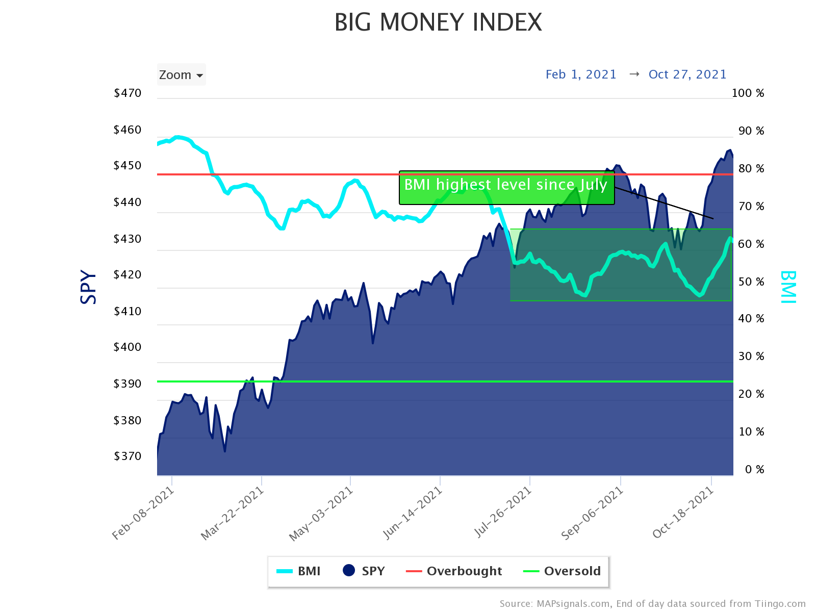
But, there’s more to the story. Only a handful of mega-cap stocks are causing the index to power higher. Looking at yesterday’s data, you can see quite a bit of sellers.
Many of the stocks getting sold are smaller-cap companies, while rich large caps attract buyers. You can see this divergence in the Big Money Stock Buys & Sells chart below:
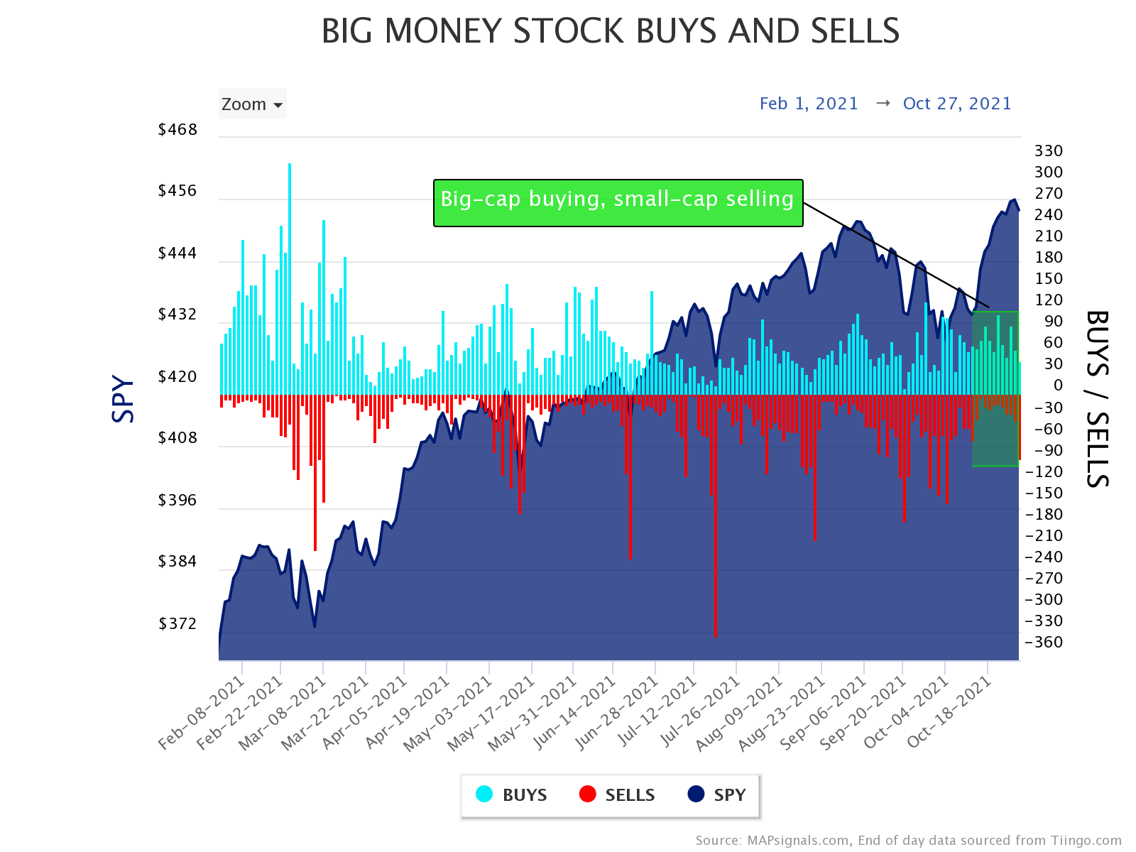
When trillion-dollar companies keep trucking higher, market cap weighted indexes rise. Let’s zoom in on that action:

As you can see, there was plenty of selling yesterday.
To us, this is where the opportunity lies…and why we embrace stock market rotations. Now, let’s keep diving deeper by looking at the sector level.
Below uses the same methodology as the charts above, but only for a given sector. Today’s example is the technology sector. First let’s rewind a bit to January and February of this year. Remember the stock buying mania back then?
I’ve circled it:
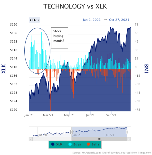
Today’s data looks quite different for the technology group. Look how there’s clearly a tug-of-war going on recently.
Here’s a zoom-in on the last few months. Clearly there’s both buying and selling going on:
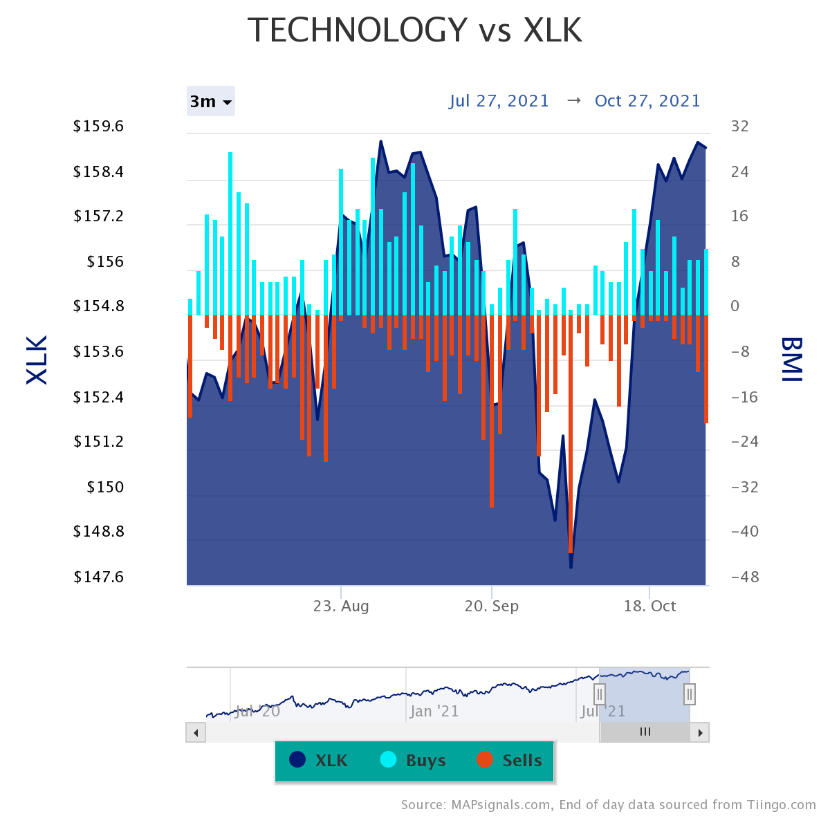
This is a stock picker’s paradise and why we say to embrace stock market rotations. In an environment like this, it’s so important to focus on the stocks getting bought.
Sector charts like this will be available soon in our portal for subscribers. Yeah, we’re excited about that!
Now, let’s look at some killer performance.
Embrace Stock Market Rotations
So, while we know there’s a lot going on beneath the surface of the market, clearly there’s opportunity, too. And this is where the MAPsignals process shines.
Focus on the stocks loved by the Big Money, and chances are you’ll outperform. Our popular monthly MAP 50 report lists the fifty stocks getting bought the most over a 6-month period. It’s an all-star lineup.
We created this report because years ago (back in our Wall Street days) we handled big stock orders for institutional clients, like hedge funds and pension funds. We learned how a handful of stocks kept getting bought day after day.
When you see action like that, it’ll change the way you think about markets. It changed us!
Check out the performance of the August MAP 50 report. Look how these 50 stocks massively outperformed the S&P 500 (SPY ETF):
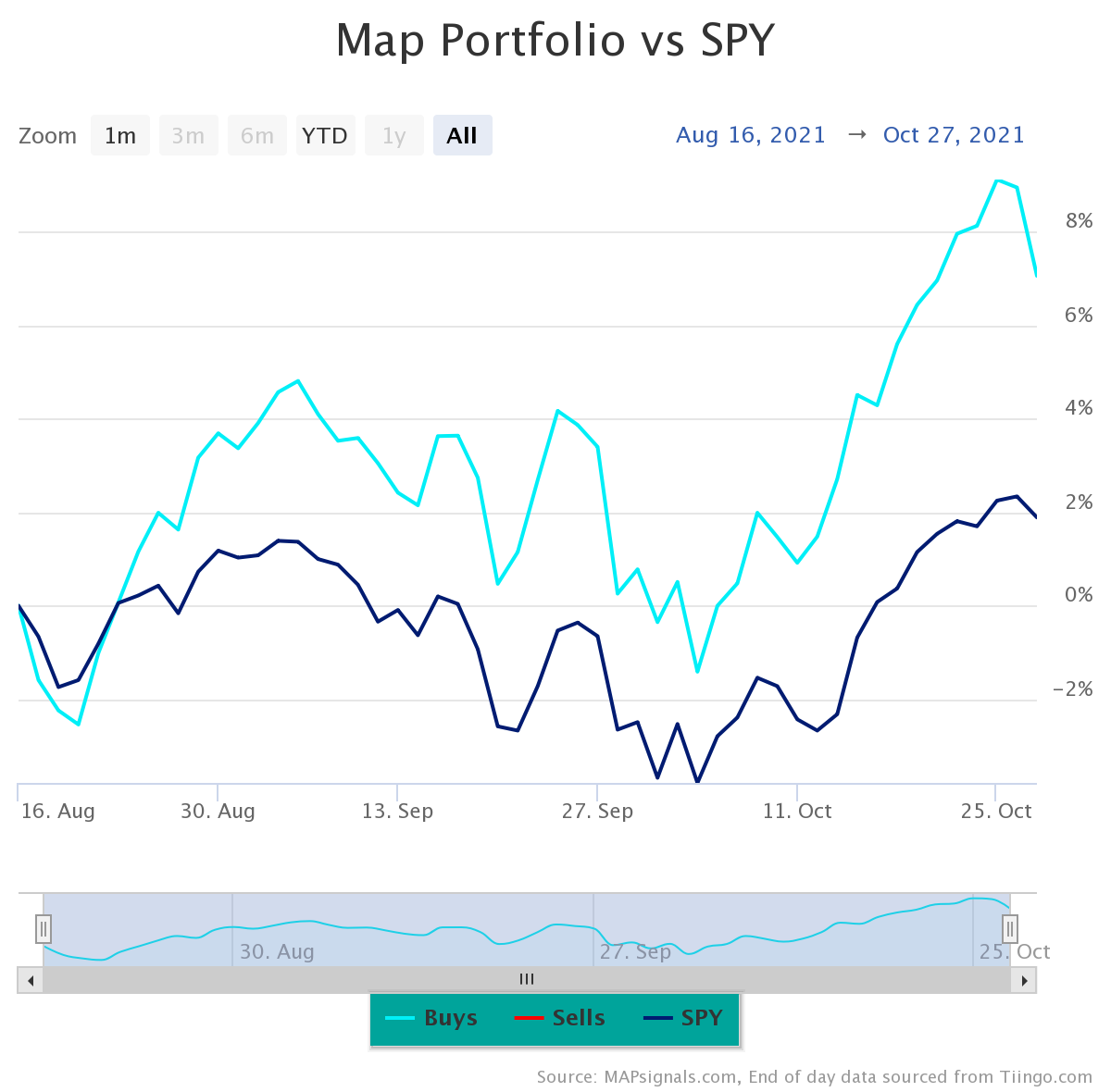
These 50 stocks gained +7.06% versus SPY’s +1.89% over the same timeframe.
Clip off the bottom 45 stocks and look what happens. The top 5 stocks from August really shined, gaining an average of +12.3% vs. SPY’s +1.89%:
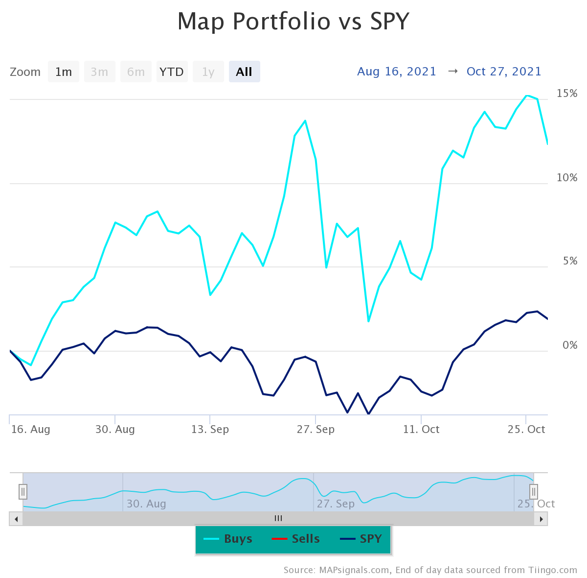
There’s only one word for that chart, JUICE!
Yes, as you can tell we love finding the best stocks out there. While the market spins keep coming, find the opportunity. Embrace stock market rotations.
Let’s wrap this up.
Here’s the bottom line: Stocks whipsaw on a daily basis. We say, focus on quality. Embrace stock market rotations and follow the Big Money. There’s opportunity out there…you just may need a market map to help guide the way????
And if you want more – check out our latest video series: Best Stocks To Buy Now for November 2021. Jason shows you our portal and process.
Enjoy!
Make sure to like and subscribe to our YouTube channel!