
Seasonal Weakness and Market Rotation
Welcome to August.
The summer often brings elevated volatility.
It’s a period defined by seasonal weakness and market rotation.
Humans are accustomed to seasonal changes.
In winter, extra clothing is needed for warmth. In spring, moods lighten up as flowers bloom.
In late summer, hurricane season ramps up as ocean temperatures rise.
Similarly, repeated patterns and seasons take shape in the stock market. Pros know that later summer often brings bouts of volatility as liquidity dries up.
We’re witnessing this right now as market behaviors have shifted the last week.
Under the surface, waves of money are rotating. We’ll unpack where the tug-of-war is focused.
Then I’ll highlight a few stocks under heavy sell pressure…and one outlier that’s been in massive demand for a year plus.
Following money flows keeps you ahead of the game.
Seasonal Weakness and Market Rotation
A few weeks ago, I discussed how summertime pullbacks should be expected…even in a raging bull market
Notable August swoons include 2015 when China growth worries sent equities plunging.
Then last year we had the carry trade unwind. Our data then signaled pure capitulation and we told you to buy with both hands.
And finally, last week we discussed how market breadth was deteriorating.
Seasonal weakness came right on time on Friday. August 1st saw all major indices fall hard. The S&P 500 dropped 1.6%…its single largest decline since March:
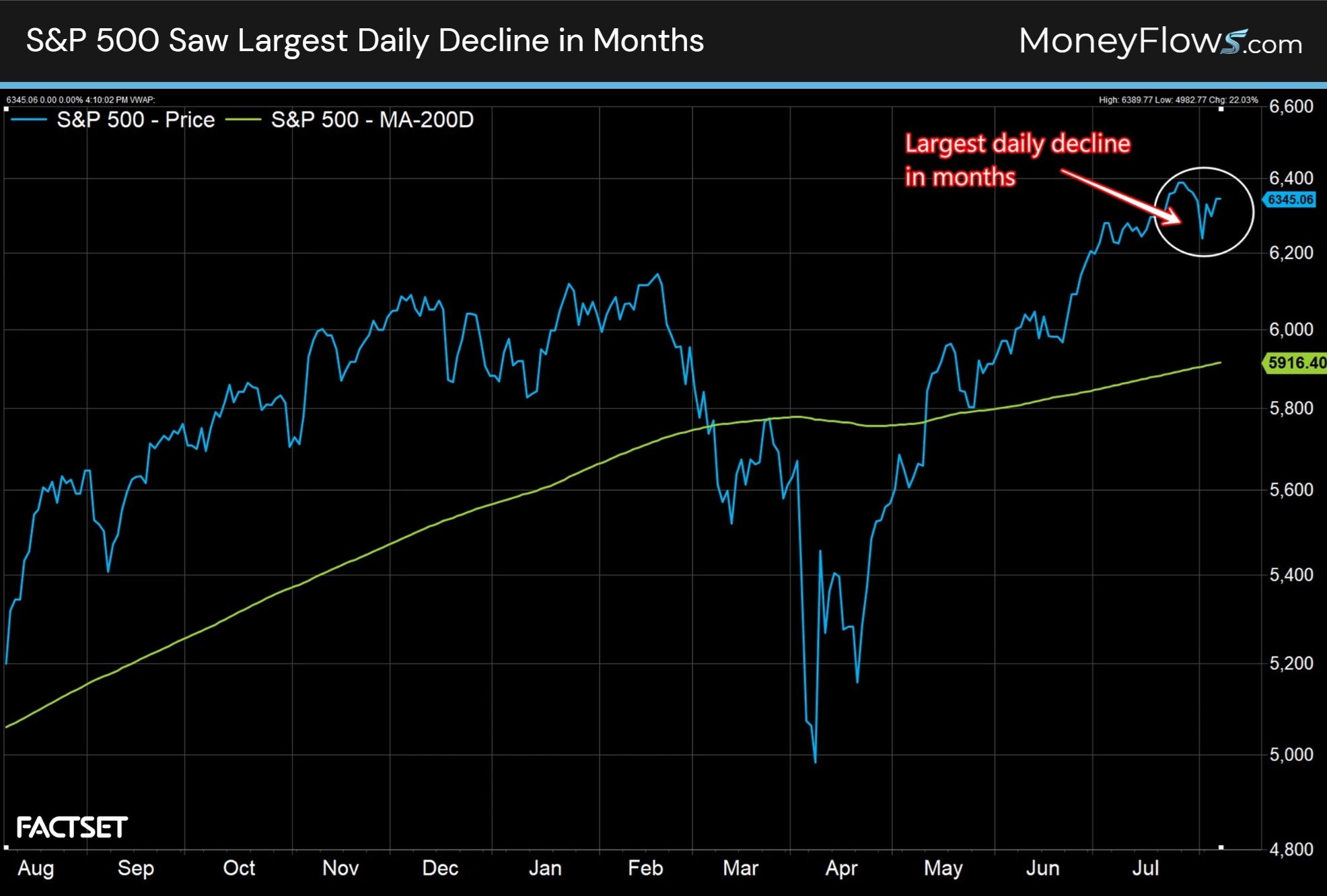
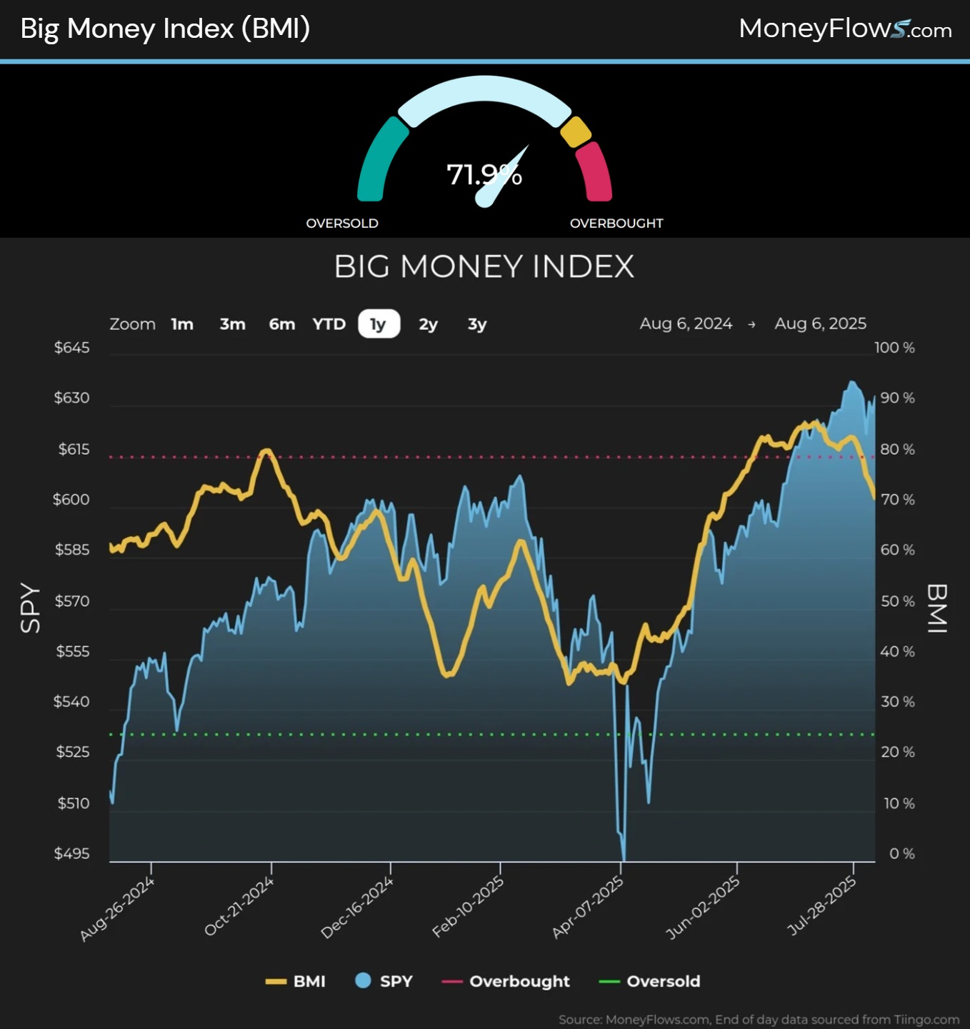
This weakness was foreshadowed by our North Star, the Big Money Index (BMI). Our flows signaled that bids were fading heading into Friday.
Below shows this beautifully…and fitting for August. In fact, this barometer is at levels last seen in May…highlighting a change in character under the surface:
Should we be surprised by this shift? NO.
August is hurricane season for stocks.
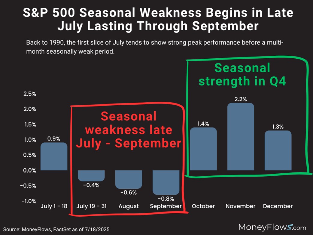
Back to 1990, seasonal weakness kicks off in late July and lasts through September.
Here you can spot how August falls .6% on average, followed by a drop of .8% in September. Then Q4 kicks off seasonal strength:
Now that we know it’s completely normal for a healthy pullback in August…let’s dive deeper into our data and unpack the rotation.
As a reminder, the BMI is constructed by measuring inflows and outflows on thousands of stocks daily. It’s a broad look at small, mid, and large-caps.
When it turns south, either widespread selling is occurring or there’s a fat rotation taking place.
As of now, the pullback is more of a market rotation.
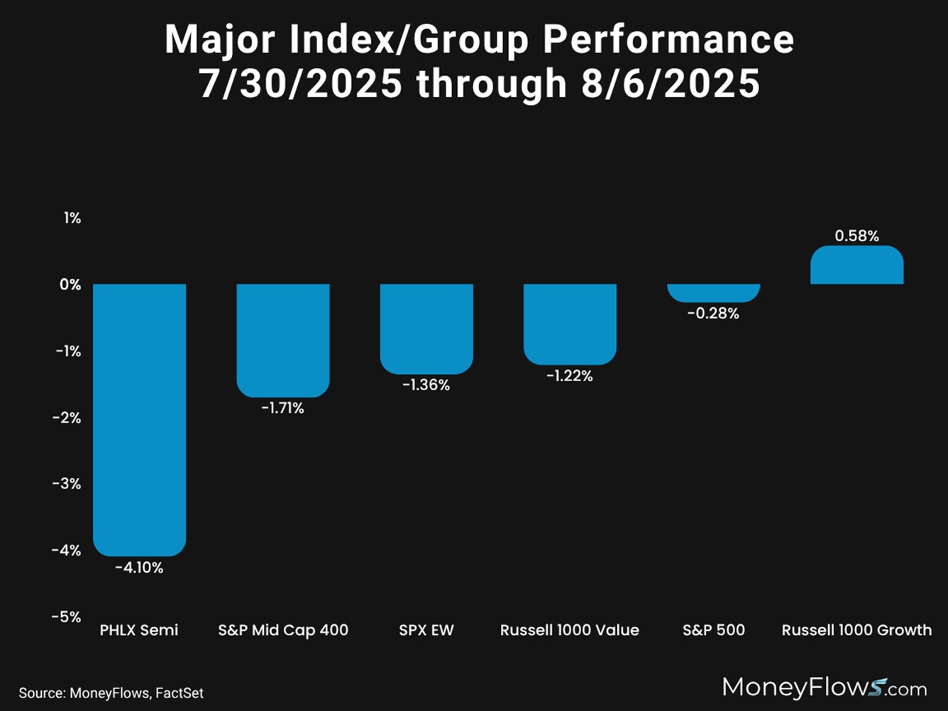
From July 30th through yesterday, some of the worst performing areas of the market have been semiconductors, mid-caps, and value stocks.
The PHLX Semiconductor index is down 4.1% and the S&P 500 Equal Weight index has fallen 1.71%.
On the flipside of the ledger, growth stocks have been cruising with the Russell 1000 Growth index up .58%
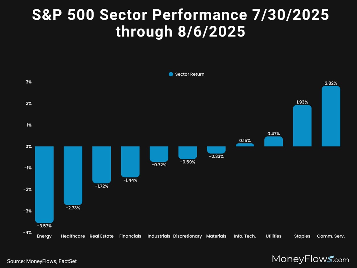
And this rotational action can also be seen inside the S&P 500. Using the same timeframe, we see 7 sectors down in the last week, with 4 perking up.
Energy and Health Care stocks have fallen hard, down 3.57% and 2.73% respectively.
Staples have climbed 1.93% and Communication Services stocks have rallied 2.82%:
This rotational tug-of-war has clearly been spotted in our data…and why the sudden drag on the BMI.
We’ve noted healthy outflows…the most in months:
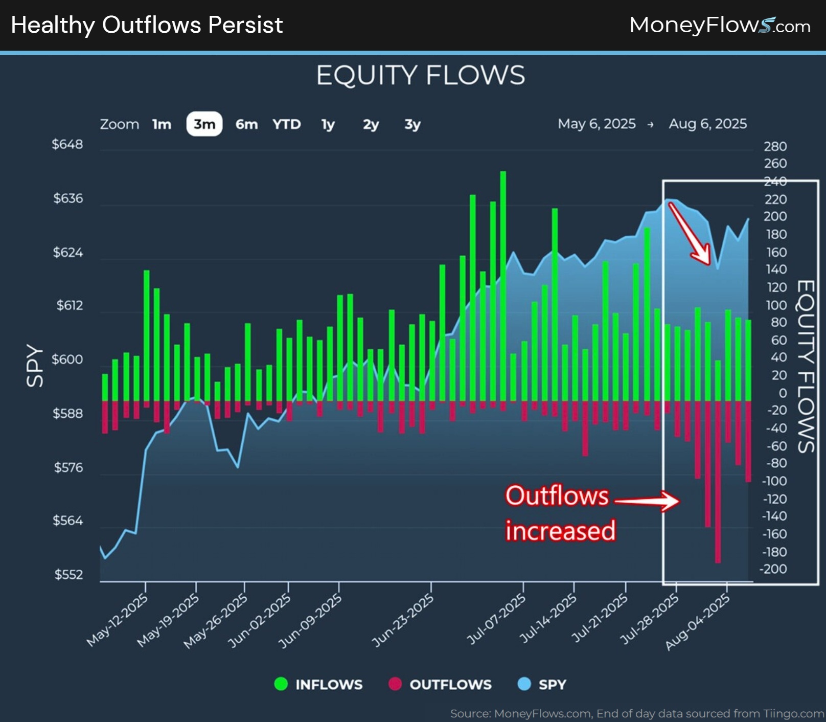
And even yesterday, the bifurcation was evident. This is where MoneyFlows data can keep you ahead of the game.
Discrete equity flows often persist for weeks and months. It’s what we experienced on Wall Street trading desks for years.
Institutions can build positions for weeks and longer.
We’re seeing that trend in 2025.
Below are yesterday’s equity flows plotted by MAP Score. There were just as many inflows as outflows, 91.
But the stock scores vary widely.
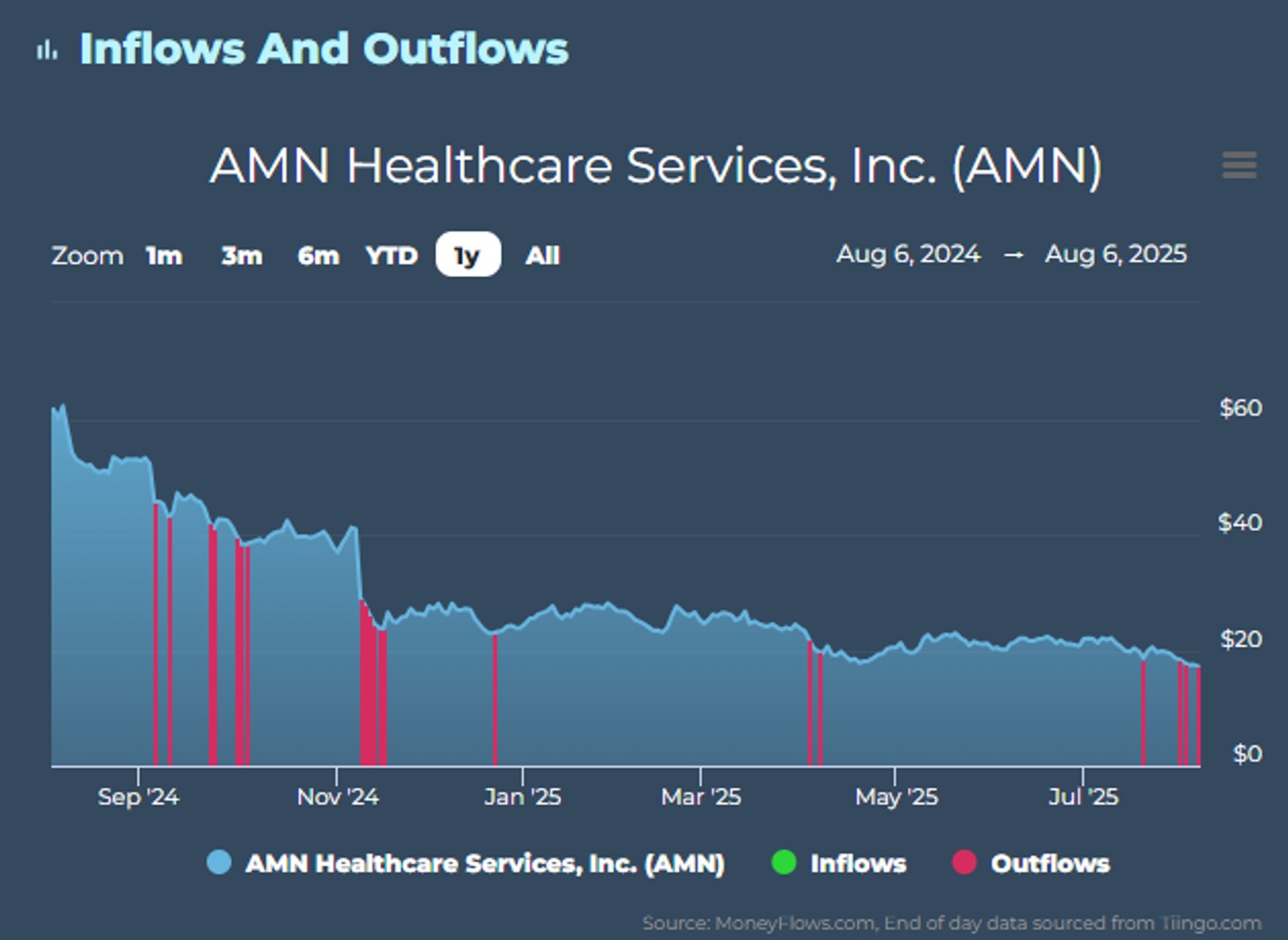
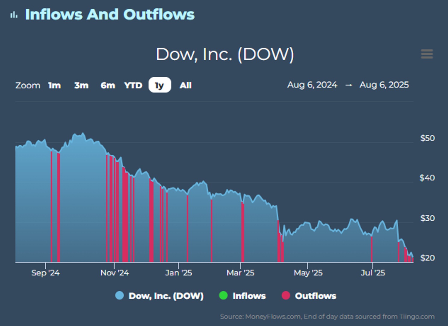
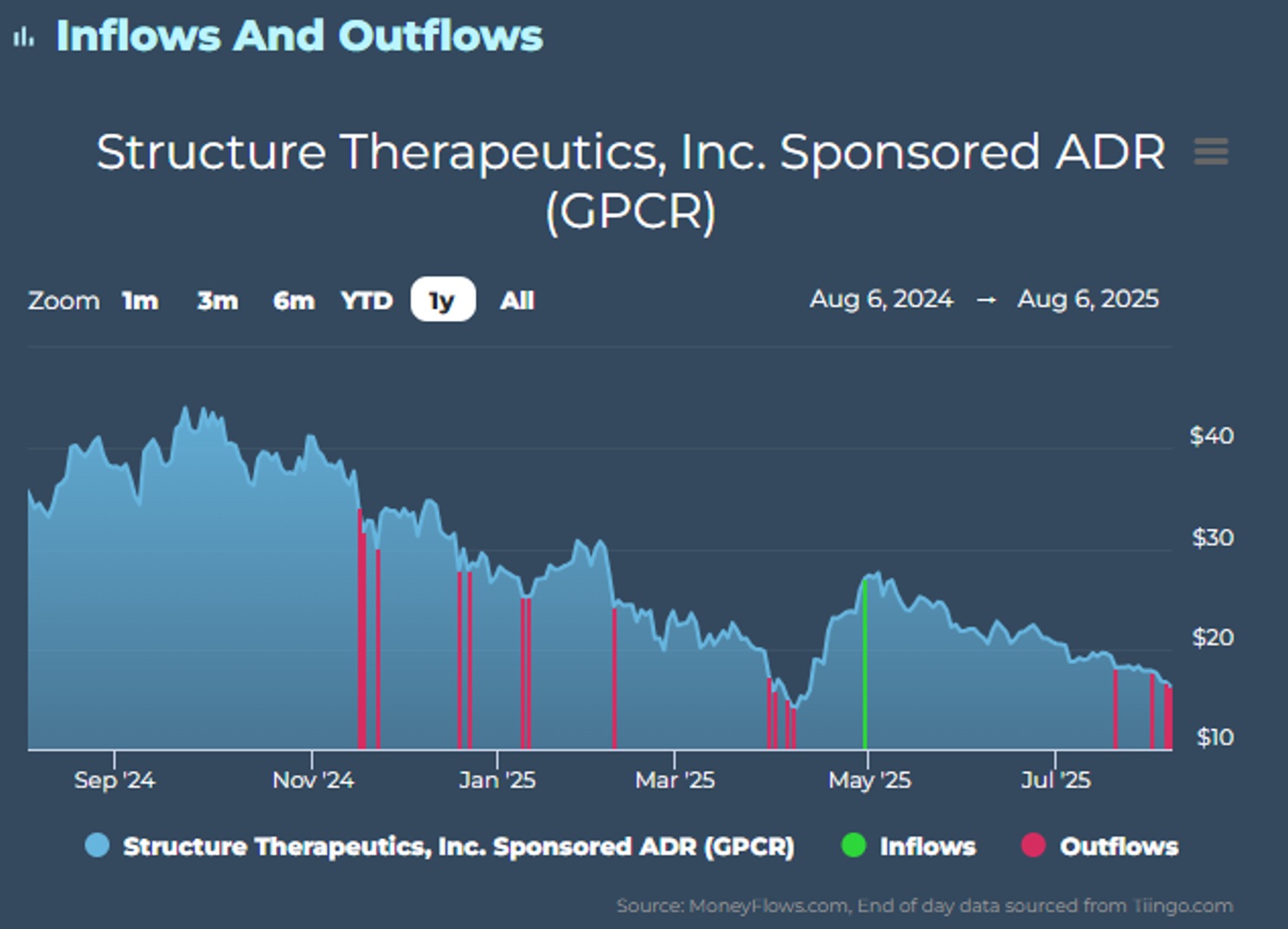
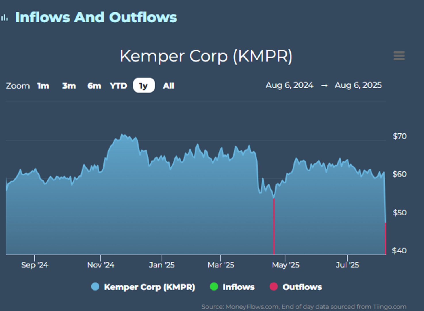
I’ve circled 3 of the lowest scores: Dow Inc. (DOW), AMN Healthcare (AMN), Structure Therapeutics (GPCR), and Kemper Corp. (KMPR).
And to the right the single strongest score: Palantir (PLTR):
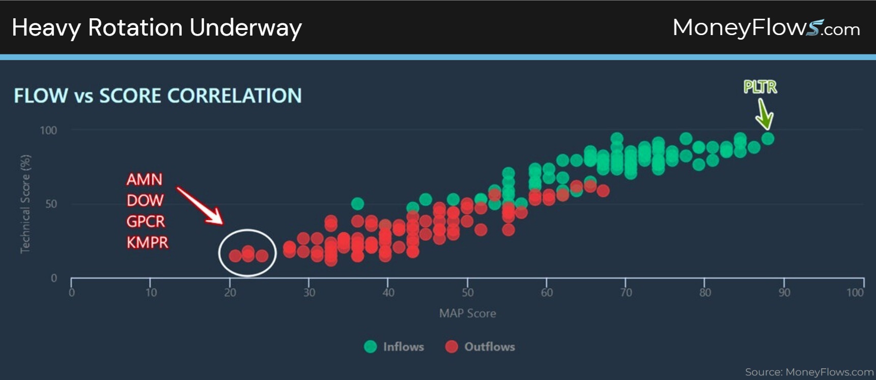
Using the eye-ball test, there’s heavy rotation underway.
Using Moneyflows data, there’s been a heavy rotation all year. Let me show you.
Let’s plot our flows data on the 4 lowest scores from yesterday. You’ll notice that sell pressure has been in place for a while.
Here’s AMN with not a single inflow all year:
Dow Inc. (DOW) shows a similar pattern:
GPCR has been sold hard with only 1 inflow all year:
KMPR’s outflows yesterday are a continuation from April’s weakness:
Scores matter.
Weakness often leads to more weakness.
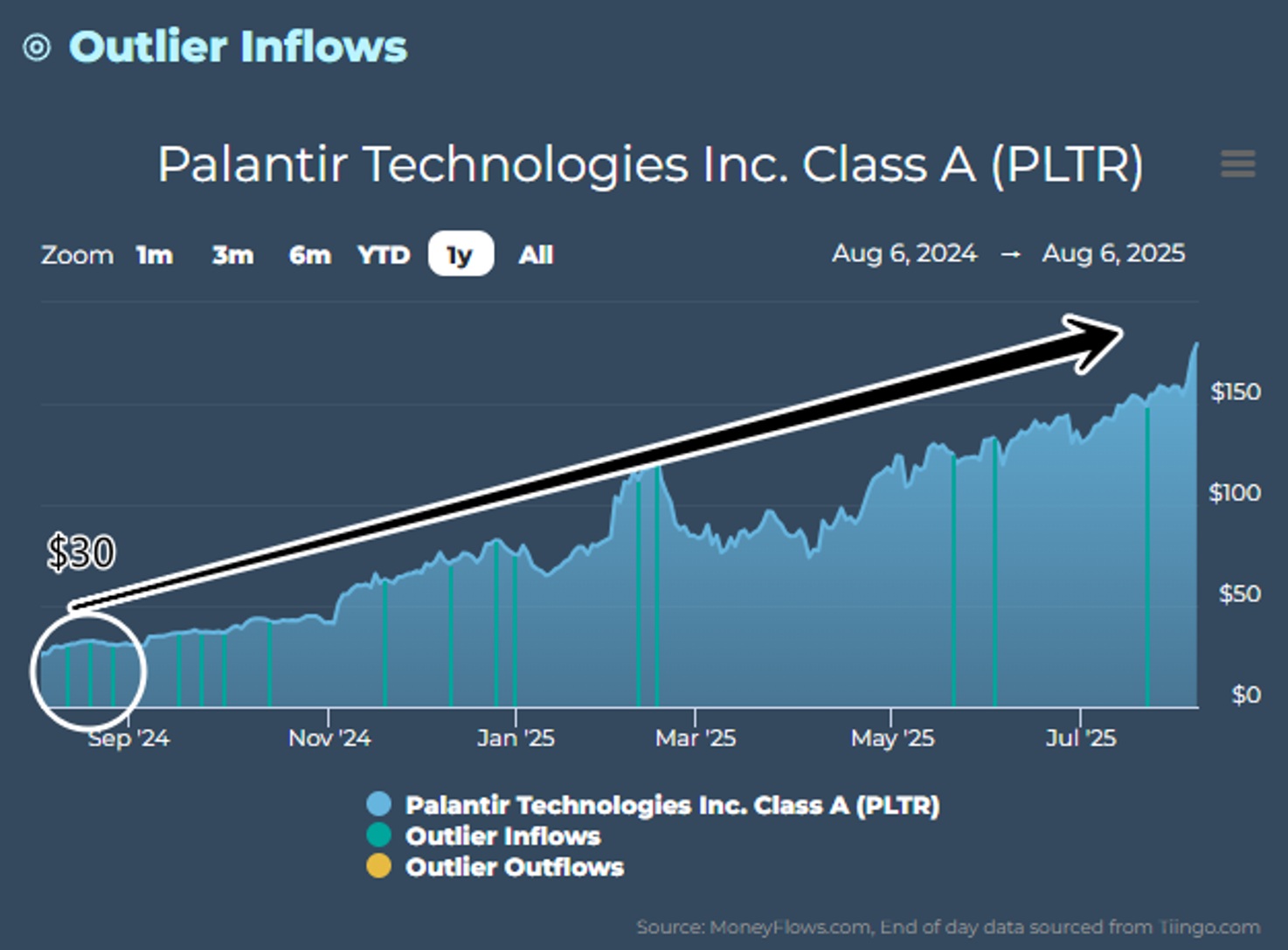
The flipside is true too. Let’s look at Palantir. This has been one of the strongest scoring stocks in our data all year.
The MAP Score is a rock-solid 87.9 constructed around strong earnings and sales growth. Yesterday’s inflow is simply a continuation of the positive flows the stock has received all year.
Palantir has not seen 1 outflow all year!
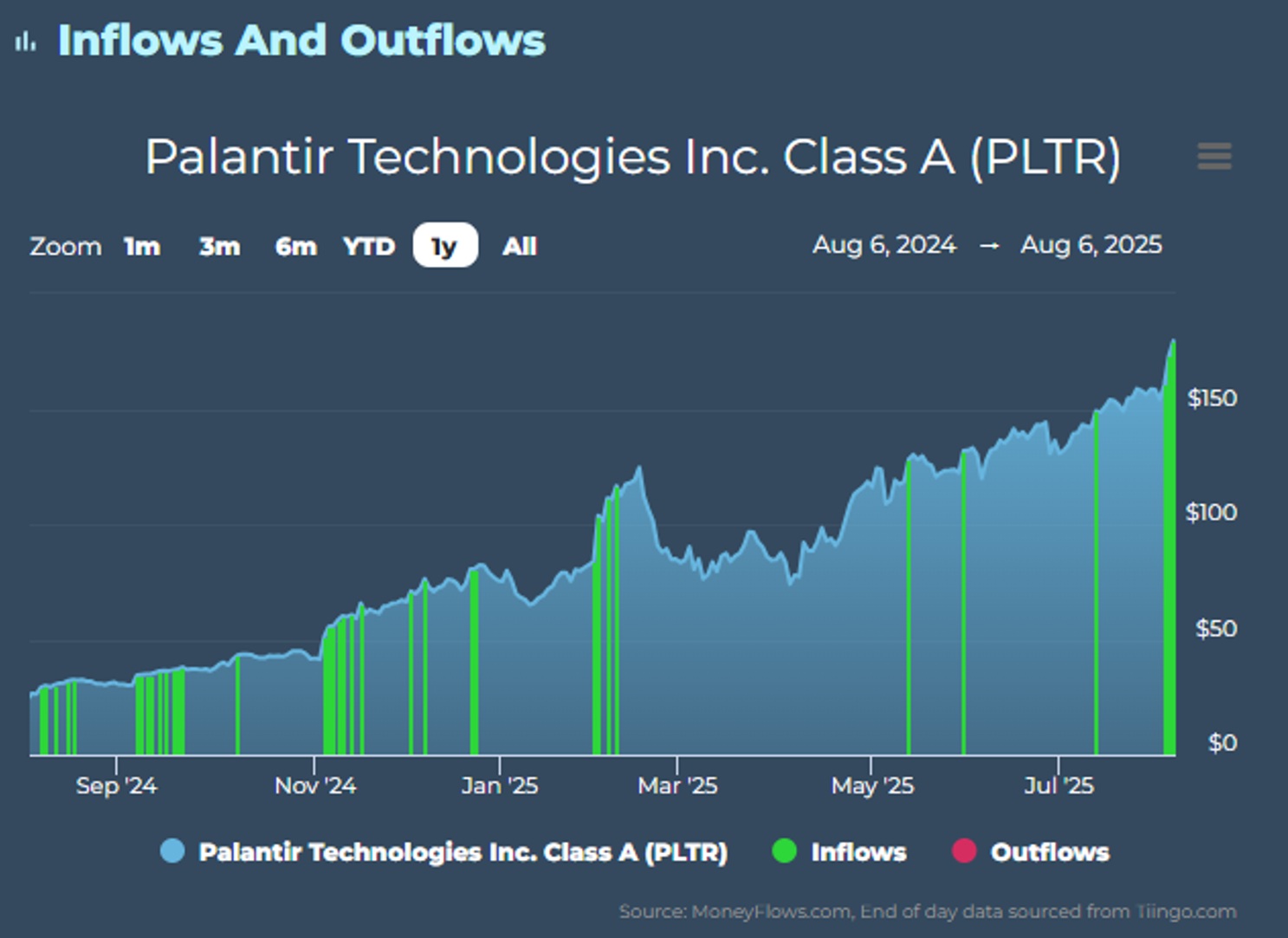
Palantir was a strong buy a year ago for us. That’s because Palantir shares were in demand, commanding one of the strongest scores.
Our Outlier 20 report showcases only the best stocks with the highest quality flows.
PLTR was $30 then and is now $180. Each blue bar is when PLTR shares appeared on our elite list:
So as we wait for the seasonal weakness and market rotation to subside…use it to your advantage.
Hop on board some of the biggest trends hiding in plain site.
You just need a market map to see it!
MoneyFlows is your map.
Get started by becoming a PRO member today. Contact us here for more information, if you’re a money manager wanting portfolio insights.
Lastly, we just made a lot of updates to our portal. Check out this video to learn how the MoneyFlows system can help you become a better investor and portfolio manager.